Local Date
6 June 2024Local Time
12:11Location
Hackney Downs, LondonCountry or Territory
United KingdomContributor
Sasha EngelmannSatellite
NOAA-18Radio Callsign
Archive ID
Coordinates
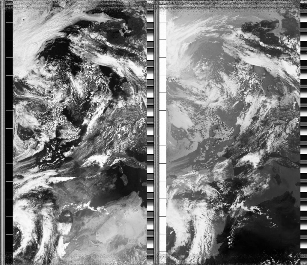
Over these last couple weeks, I sometimes observe the darkness of the landforms in the satellite images, especially in the Infrared Channel, usually on the right side. Though I have not studied infrared radiation scientifically, I know that, in the Infrared channel, the darker the pixels suggest that something is 'warmer' while the lighter pixels suggest 'cooler'. In today's image, even the northernmost part of Norway appears to be relatively dark, emanating and radiating heat against the neutral gray of the Barents Sea. The coastline and interior of the African continent also stands out in the InfraRed channel. Yesterday, a colleague who works in Cambodia studying the lives and labour of brick kiln workers told me about how the workers measure time and seasons by how fast it takes a large ball of clay to dry outside. In some seasons it takes five days, while in other seasons it only takes five hours. Their work rhythms are intimately related to the drying of the clay, and so also the heat and movement of air. In a meeting this morning I was reminded of Michael Taussig's writing on heat. He says, "Heat is a force like color, that sets aside the understanding in place of something less conscious and more overflowing, radiance instead of line, immanence instead of the famous bird's eye view" (Taussig, 2004: 31). As I pored over the 'satellite-eye's view' of today, I wondered about where heat as a 'force' shows up. Does it only show up in the clay ball that tells about heat by how fast it dries? Or does the force somehow also 'show up' in the satellite image, in the darkness and contrast of pixels? Thinking of the ball of clay makes me feel more connected to the idea of heat as 'force', but I keep wondering whether there are ways to use colour ('something less conscious and more overflowing') to demonstrate or express more of heat in the satellite image. In contrast to 'heat maps' where red and dark purple often signify the intensity of heat, how else could colour map heat, how else might it suggest 'immanence' or 'radiance' instead of line?